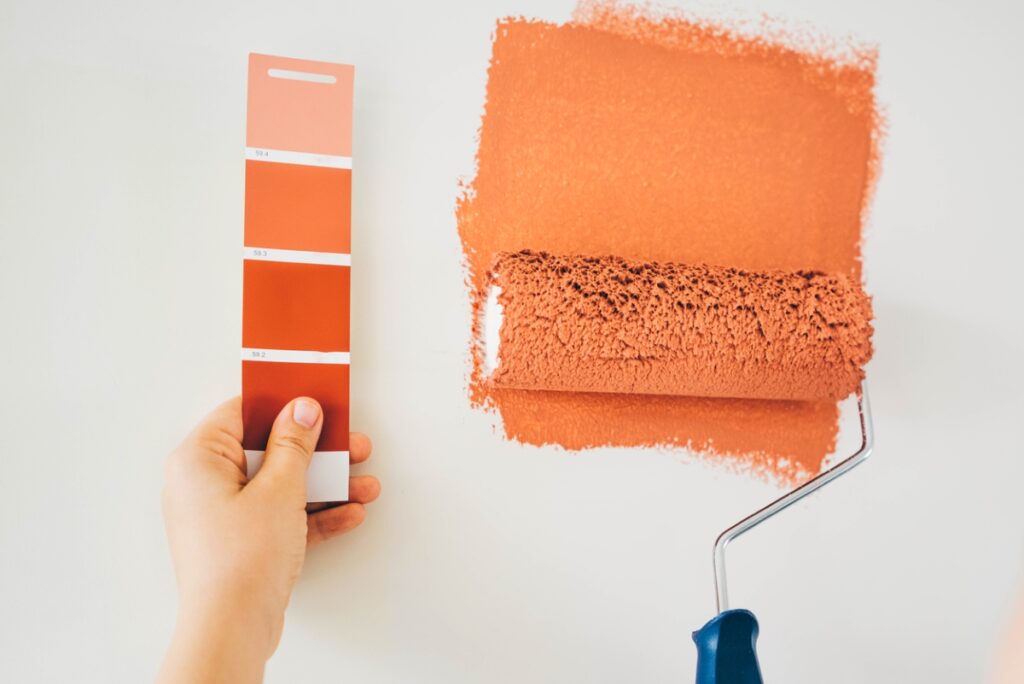
Paint can appear lighter or darker on your walls than it does on the sample or swatch. This happens because lighting, wall texture, and the surrounding colors affect perception. Always test a small section on your wall before committing to the full paint job to see the true color in your space.
If you have ever wondered does paint look lighter or darker than the sample, you are not alone. I have tested thousands of swatches in real homes, and I will show you why chips mislead, how light and sheen shift color, and how to test paint the right way. Read on to learn how to predict the final look with confidence and avoid costly repaints.

Why paint looks different on your walls than on the sample
Most people hold a tiny chip and try to imagine a full room. That small chip lives under bright store lights and next to pure white cards. Your wall is larger, textured, and hit by changing light. Scale and light make colors behave in new ways.
So, does paint look lighter or darker than the sample? In bright rooms and with flat sheens, it often looks a touch lighter. In low light, glossy sheens, or shadowed corners, the same paint can look darker. The question does paint look lighter or darker than the sample only has one honest answer: it depends on light, sheen, and surroundings.
I have watched mid-gray walls turn blue in morning light, then taupe by night. That is not the paint “lying.” It is your eyes responding to light temperature and contrast. Understanding that shift is the key to getting the result you want.
Kilz Original Water Based Primer – When and How to Use It for Best Results

The science behind the shift: light, sheen, and LRV
Paint chips are printed or painted on smooth white cards. Your wall is larger and may have texture. That changes how light scatters. Flat paint scatters light and tends to look lighter. Glossy paint reflects light and can look darker, especially at sharp angles.
Light Reflectance Value (LRV) matters. LRV is a number from 0 to 100 that shows how much light a color reflects. Higher LRV colors bounce more light and read brighter. Lower LRV colors absorb light and read deeper. A color with LRV 60 will feel lighter on a big wall than it does on a small chip. But under warm, dim bulbs, it can drop a notch and look darker.
Store lights are cool and strong. Home light is mixed and weaker. Under cool daylight, grays can look crisp. Under warm LEDs, those same grays can pull beige. This is why does paint look lighter or darker than the sample is a moving target. You are not wrong. The light is.

Factors that make paint look lighter or darker than the sample
Here is a simple checklist to predict the shift.
- Lighting type and strength Natural daylight reads cooler and brighter. Warm LEDs or lamps can mute colors and make them look darker.
- Direction of light North-facing rooms are cool and soft. Colors look a bit darker and grayer. South-facing rooms are warm and bright. Colors often look lighter.
- Time of day Morning can cool colors. Afternoon can warm them. Night adds yellow or amber from bulbs.
- Sheen level Flat looks lighter and hides flaws. Eggshell and satin add a slight darkening. Semi-gloss and gloss can look darker from glare.
- LRV The lower the LRV, the more a color can sink in dark rooms. The higher the LRV, the brighter it will look in most spaces.
- Primer color A tinted or gray primer helps mid to dark colors stay true. White primer under deep colors can make them look chalky or lighter.
- Number of coats Two full coats are standard. One thin coat can look lighter and patchy. Proper coverage locks in the true color.
- Adjacent colors A bright white trim can make a wall color look darker by contrast. Wood tones can warm the wall color.
- Surface texture Smooth walls reflect more evenly. Heavy texture can trap shadows, making colors read darker.
- Room size and furnishings Big, sparse rooms feel brighter. Packed rooms absorb light and darken the read.
- Wet vs dry paint Wet paint is darker. It lightens as it dries and cures over days.
These inputs explain why we ask, does paint look lighter or darker than the sample. Each factor nudges the outcome up or down.
How to test paint the right way
I learned this the hard way on a client’s north-facing living room. The perfect gray turned blue by noon. Since then, I follow this process.
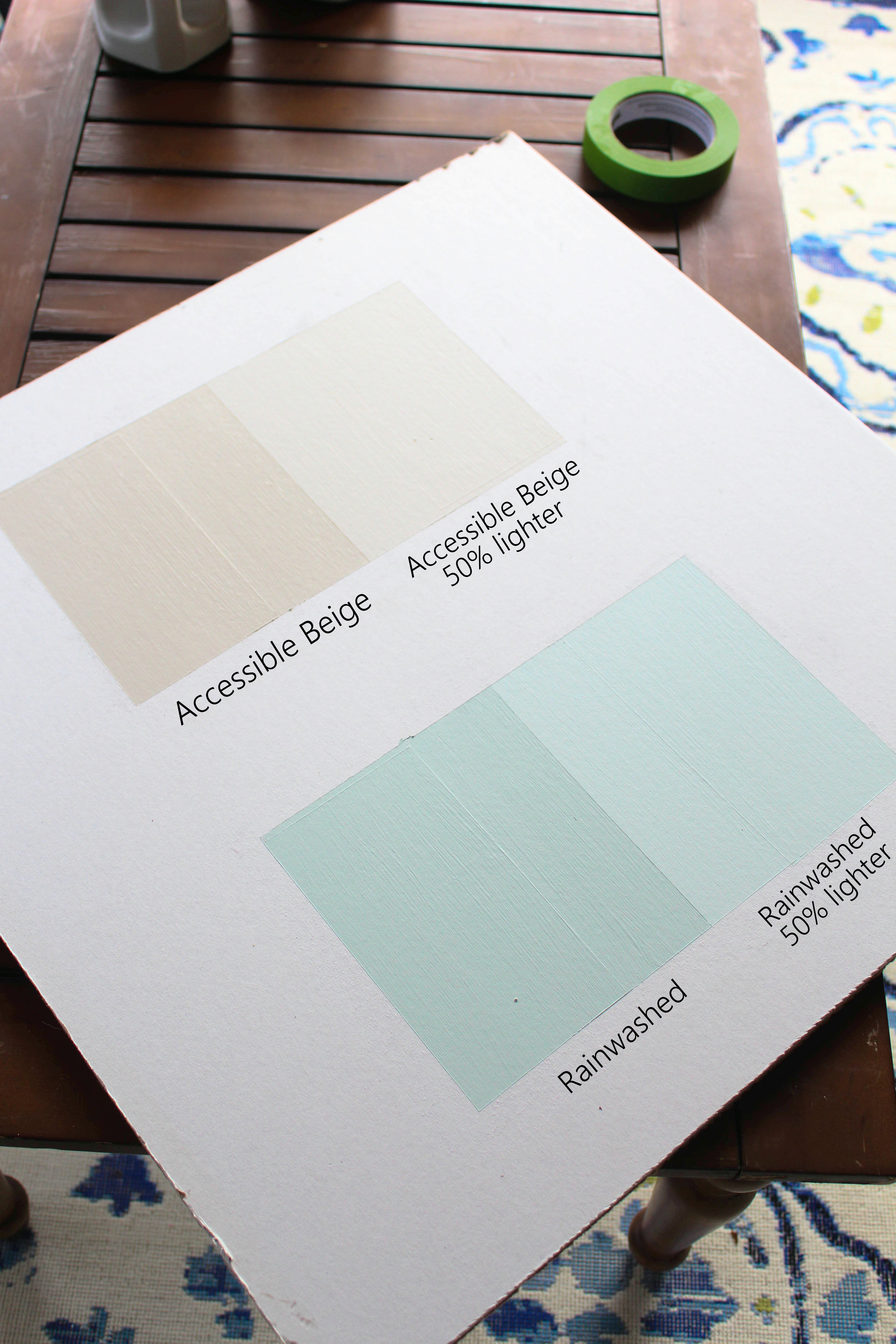
- Test on boards Use 12×12 inch or larger foam boards. Paint two coats. Label with color, sheen, and LRV.
- Prime like the wall If your wall needs primer, prime the board the same way.
- Test sheen too Paint half the board in your final sheen. Sheen changes everything.
- Move the board Place it in corners, near windows, and behind lamps. Watch it all day and at night.
- Compare against trim Put the board next to your trim and floors. Contrast shifts the read.
- Photograph it Use your phone in daylight and at night. Photos catch shifts your eyes miss.
- Sleep on it Live with the boards for 48 hours. Note how it feels in real life.
If you are still unsure and asking, does paint look lighter or darker than the sample, trust the board that looks best most of the day, not just at noon or midnight.
Zinsser Cover Stain Primer: Ultimate Guide and Hands-On Review

Choosing the right shade when you are on the fence
Here are simple rules that have saved me and my clients time and money.
- If the room is dim or north-facing Choose a color with 3–5 higher LRV than your target. It will read closer to the chip.
- If the room is bright or south-facing You can stay with the chip or go one step darker to avoid a washed-out look.
- If you need a calm, low-glare finish Pick flat or matte for walls. They read lighter and softer.
- If you have kids or high-traffic areas Use eggshell or satin, but test first. It might read a half-step darker.
- If you see a strong undertone Adjust within the same strip. Go cooler to tame yellow. Go warmer to tame blue.
This is where the question does paint look lighter or darker than the sample becomes a plan. You are not guessing. You are steering the result.
Real-world examples and pro tips
A small bath with no window: The client chose a mid-gray chip. On the wall it looked darker and dull. We raised LRV by 8 points and used matte. The final room felt larger and fresh.
A sunny, open-plan kitchen: The client chose a soft white chip. It looked lighter and almost sterile. We dropped one shade darker and moved to eggshell. The space felt warm yet clean.
A moody bedroom goal: The chip looked perfect at night but flat by day. We kept the color, lowered the sheen, and added a gray-tinted primer. The color held steady.
Pro tips I use every week:
- Look up LRV on the manufacturer’s site. It is the quickest way to predict shifts.
- Use neutral gray boards to mount chips. It reduces color bias from your table or floor.
- Swap bulbs first. A 3000K LED can fix a “why does paint look lighter or darker than the sample” problem without touching a brush.
- Paint sheen strips. One board, three sheens. You will see the truth fast.
- Stop judging wet paint. Wait for full dry and cure. Then decide.

Related concepts to know
Clear terms help you shop and test with skill.
- Swatch or chip A small card with the color. Good for a first look, not a final call.
- Drawdown A pro sample made with real paint at a set thickness. Very accurate.
- LRV Light Reflectance Value. The higher it is, the lighter the room feels.
- Metamerism Colors that match under one light but not another. Very common in grays.
- Undertone The subtle hue under the main color. Blue, green, red, or yellow can hide in “neutral” paint.
- Hiding power How well a paint covers what’s under it. Impacts the final read.
- Open time and cure time Dry to touch is not cured. Color can settle over days.
These concepts answer the core worry: does paint look lighter or darker than the sample, and why it changes from store to home.
Frequently Asked Questions of does paint look lighter or darker than the sample
Does paint dry lighter or darker?
Most paints dry a bit lighter than they look when wet. Final color sets after full dry and cure, which can take a few days.
Why does my gray look blue on the wall?
Light temperature and nearby colors push undertones forward. Cool daylight or bright white trim can make gray read blue.
Should I choose a shade darker than my chip?
If your room is very bright, going one shade darker can prevent a washed-out look. In dim rooms, stay the same or go lighter.
Will higher sheen make my color look darker?
Yes, higher sheen reflects light and can deepen color at angles. Eggshell and satin may read a half-step darker than flat.
How big should my paint sample be?
Use at least 12×12 inches, two coats, on a primed board. Larger samples reveal shifts across different walls and lights.
Do bulbs change how paint looks?
Yes. Warmer bulbs soften and can darken colors. Cooler bulbs brighten and can make colors look lighter and crisper.
Can primer color affect the final shade?
It can. Gray or tinted primer often keeps mid to dark colors true. White primer can make deep colors look chalky or lighter.
Conclusion
The honest answer to does paint look lighter or darker than the sample is this: it depends on light, sheen, LRV, and context. But with the right tests, you can predict the shift and choose with confidence. Use big samples, match the primer and sheen, and judge the color in your own light.
Ready to try it? Pick three close shades, make large boards, and live with them for two days. Share your results or questions in the comments, and subscribe for more step-by-step paint guides.
Related posts:
 Does a Second Coat of Paint Make It Darker? Why Paint Looks Different & Solution
 How to Match a Behr Paint Color to Benjamin Moore (2026) – Accurate Methods Paint Stores Don’t Tell You
 Spray Paint Temperature Range: Your Complete Guide to Perfect Outdoor Finishes
 How to Use Rust Oleum Spray Paint – Step-by-Step Guide for Perfect Results