Discover effective techniques to test paint colors without committing to your walls. From sample boards to digital tools, find the perfect paint color with confidence.
Introduction
Choosing the right paint color is one of the most impactful decisions you can make for your home’s interior design. Yet many homeowners rush this critical choice, leading to disappointment and costly do-overs. Testing paint colors before committing isn’t just helpful—it’s essential for achieving the look you envision.
The most common mistakes when choosing paint without proper testing include misjudging how colors appear in different lighting conditions and failing to consider how a small paint chip will look when covering an entire wall. Nearly 60% of homeowners report feeling disappointed with their paint color choice after application, according to a recent survey by the National Association of Home Builders.
Understanding Color Dynamics

How Lighting Affects Paint Perception
Paint colors transform dramatically under different light sources. Natural daylight reveals a color’s truest form, while incandescent lighting brings out warm tones and fluorescent lighting emphasizes cooler hues. This variation explains why a paint color that looked perfect in the store can appear completely different in your home.
The Influence of Room Size and Decor
The size of your space significantly impacts how colors are perceived. Dark colors can make small rooms feel more intimate but potentially cramped, while light colors expand visual space. Your existing furniture, flooring, and textiles will also interact with wall colors in ways that can be difficult to predict without testing.
This study investigates how different materials and room sizes influence people’s perceptions in VR-simulated indoor environments, using preference surveys and non-parametric statistical tests. Findings show significant differences in material preferences and suggest potential applications for enhancing smart building design.
Preparation Before Testing

Gathering Essential Tools and Materials
Before you begin testing paint colors, collect these necessities:
- White poster board or foam core
- Sample paint pots (available at most hardware stores)
- Painter’s tape
- Quality paintbrushes in various sizes
- Small paint rollers for texture matching
Choosing the Right Paint Samples
When selecting paint samples, don’t limit yourself to just one shade. Choose at least three variations—one that’s slightly lighter, your target color, and one that’s slightly darker. This approach helps account for how colors appear differently in your specific environment compared to store lighting.
Alternative Methods to Test Paint Colors
Using Large Sample Boards
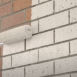
One of the most effective testing methods involves painting large movable boards rather than your actual walls. By creating 2′ x 2′ sample boards, you can:

- Move them around different areas of your room
- View them at various times of day
- Place them next to furniture, window treatments, and flooring
- Compare multiple colors simultaneously
This technique gives you a much better sense of how the color will look in your space without any commitment.
The Power of Peel-and-Stick Paint Samples
Modern solutions like peel-and-stick paint samples offer convenience without mess. These pre-painted adhesive sheets can be applied directly to your wall and easily removed or repositioned. They typically cost between $3-$10 per sample and provide a much larger color representation than traditional paint chips.
Digital Visualization Tools: Apps and Software
Technology has revolutionized paint color testing. Apps like Sherwin-Williams ColorSnap® Visualizer and Benjamin Moore’s Color Portfolio allow you to upload photos of your room and digitally “paint” the walls. While these tools aren’t perfect in representing exact color accuracy, they provide a helpful preliminary visualization that can narrow down your choices.

Smart Techniques for Effective Color Evaluation

Testing Colors in Different Lighting Conditions
Paint appears differently throughout the day as natural light changes. A pale gray might look perfect in morning light but take on an unwanted blue cast in the afternoon. Professional designers recommend evaluating your paint samples at three key times:
- Morning (natural daylight)
- Afternoon (peak brightness)
- Evening (with artificial lighting)
This thorough approach reveals how versatile your color choice will be across all conditions.
This study explored how different interior design elements — like materials, surfaces, and colors — influence how people perceive the comfort and efficiency of a living room. Using virtual reality environments, 31 participants rated how they felt about various design setups. The research found that while design features can impact people’s feelings of satisfaction and usability, materials and colors alone were not strong factors in shaping clear impressions of the space. Instead, people’s actions and experiences within the space played a bigger role in how they judged the design.
Moving Samples Around the Room
Don’t just test paint in one location. Walls facing windows receive different light than interior walls. Corners may appear darker than center sections. By relocating your sample boards or peel-and-stick samples, you’ll discover how the color behaves throughout the entire space.
Advanced Strategies for Better Accuracy
Mimicking Final Wall Textures
The texture of your walls significantly impacts how paint appears. When creating sample boards, try to match your existing wall texture for the most accurate representation. For smooth walls, use sanded primer board; for textured walls, apply a thin layer of drywall compound to your sample board before painting.
Using Primer-Backed Sample Boards
For the most accurate color testing, apply primer to your sample boards before adding paint. This step is particularly important when testing light colors or when your existing wall color is dark or vibrant. Professional painters recommend using the same primer you’ll use for the actual project to ensure consistent results.
Common Mistakes to Avoid
Judging Color Too Quickly
Paint requires time to dry completely before revealing its true color. Wet paint often appears darker and shinier than it will once dry. Allow at least 24 hours before making your final assessment. Approximately 35% of color dissatisfaction comes from evaluations made too early in the drying process.
Ignoring Adjacent Room Colors
Your home’s color flow matters. Test paint colors with consideration for adjacent rooms, especially in open floor plans. Colors should complement each other rather than clash, creating a harmonious transition between spaces.
Expert Tips for Confident Decision-Making
Narrowing Down a Color Palette
Start with a broad collection of color options, then systematically eliminate those that don’t work in your space. Begin with 8-10 potential colors, test them using one of the methods above, then narrow to 3-5 finalists for more extensive testing. This funneling approach helps prevent overwhelm while ensuring thorough evaluation.
Utilizing Professional Color Consultation Services
Many paint stores and interior designers offer color consultation services. These professionals bring trained eyes and experience to help you select colors that will work in your specific space. While services typically range from $75-$200, this investment can save hundreds or even thousands in painting mistakes.
Special Considerations
Testing Dark vs. Light Paint Colors
Dark colors require special testing considerations as they tend to look even darker when covering an entire wall. When testing deep hues like navy, charcoal, or forest green, create larger sample areas—at least 3′ x 3’—to accurately gauge their impact. Dark colors also show more variation between different lighting conditions.
Handling Bold and Vibrant Shades
Vibrant colors can be particularly tricky to evaluate. Their intensity often appears amplified when applied to an entire wall. For bold colors, consider testing at 75% strength (asking the paint store to reduce the formula) alongside the full-strength version to see which provides the right balance of impact without overwhelming the space.
Best Method: Large Sample Boards
Among all the techniques to test paint colors without painting your walls, large sample boards (2′ x 2′ or larger) stand out as the most effective method. This method’s superiority comes from its balance of accuracy, flexibility, and practicality – giving you the closest approximation to the final result while allowing for thorough evaluation under all conditions your walls will experience.
Finalizing Your Choice
Creating a Mini Color Mockup
Before making your final decision, create a small-scale mockup of your room using paint chips or colored paper cut to scale. Include representations of your flooring, major furniture pieces, and any fabrics or artwork. This bird’s-eye view can reveal color relationships that might be missed when viewing individual samples.
Double-Checking Finish and Durability Options
Once you’ve selected your color, consider which finish will work best. Flat finishes hide wall imperfections but are harder to clean; eggshell offers a slight sheen with improved washability; semi-gloss and gloss provide durability for high-traffic areas but highlight wall flaws. Test your chosen color in the intended finish before purchasing gallons.
Conclusion
Taking time to properly test paint colors saves money, prevents disappointment, and ensures your space reflects your vision. The small investment in sample pots and testing materials pays dividends in satisfaction with your final result. Remember that professional painters universally agree: proper color testing is the foundation of successful painting projects.
The most successful home painters understand that patience during the testing phase leads to perfection in the final application. By exploring multiple testing methods and evaluating colors under various conditions, you’ll develop confidence in your selection and create a space that truly delights you each time you enter.
Frequently Asked Questions (FAQs)
Can I reuse sample boards for multiple color tests?
Yes, sample boards can be reused if you sand them between colors and apply a fresh coat of primer. However, for the most accurate results, using fresh boards for each color is recommended, especially when testing light shades.
Are peel-and-stick samples accurate representations?
Peel-and-stick samples provide approximately 90% color accuracy. They’re excellent for initial testing but consider following up with an actual paint sample for your final decision, particularly for important spaces like living rooms and bedrooms.
How big should my sample area be for the best evaluation?
Professional designers recommend sample areas of at least 2′ x 2′ for standard colors and 3′ x 3′ for dark or bold colors. Smaller samples fail to demonstrate how color truly fills a space and interacts with the room’s dimensions.
Do paint apps really predict real-world results?
Digital visualization tools provide about 75-80% accuracy. They’re useful for preliminary narrowing of choices but shouldn’t replace physical testing. Factors like screen calibration and room lighting affect digital accuracy.
What if my selected paint looks different after full application?
If your painted wall doesn’t match your expectations, don’t panic. Wait 48 hours to evaluate it in all lighting conditions. If you’re still unhappy, many paint stores offer satisfaction guarantees and can help adjust the formula slightly to achieve your desired result.
Related posts:
 7 Proven Ways: How To Eliminate Brush Strokes When Painting
 8 Alternatives To Painting Brick – Choose the Right Brick Wall Treatment
 Best Paint for Kitchen Cabinets Without Sanding – No Prep, No Mess, Long-Lasting Results | Expert Tested
 How to Test Emulsion Paint for Compatibility With Your Surface: Expert Tips